
Editor’s Note: This post originally appeared on the EducationNext blog and is posted here with permission.
Increasingly, families have a choice of schools instead of just one default neighborhood school. Especially in cities, the number of available choices is often large.
One way that consumers in the education market become informed is through online displays of school choice information, sometimes referred to as school shopping websites or school finders. These websites contain profiles of individual schools. While the content and presentation varies across sites, these profiles typically contain information about topics such as academic performance, program offerings, and student demographics. Some cities, like Washington, DC, Indianapolis, and New Orleans, have integrated these school shopping websites with the cities’ online common application portals, meaning that parents have the profiles at their fingertips as they submit school requests. What they see in those profiles could directly affect which schools they select and where their children ultimately enroll.
Countless decisions go into the creation of these school profiles and the shopping websites that contain them. Some decisions—such as whether to use letter grades or numerical ratings to represent school performance—likely follow from lengthy discussions between many stakeholders. Other decisions—such as which layouts, fonts, and website navigation tools to use—might be left to the discretion of a web design team. However, even seemingly mundane decisions about the design of these sites can shape which schools parents consider and what they learn about each school. These decisions produce the “choice architecture” in which parents make school decisions for their children.
We wanted to learn more about how information design decisions affect parents’ consumption of that information and eventual choices. We conducted a randomized experiment with 3,500 low-income parents of school-aged children. After these parents volunteered for our online study, we randomly assigned them to see one of 72 different versions of a school shopping website. Each version of the website showed information about the same set of schools in the same hypothetical district, with some schools more desirable in one way (e.g., academically higher performing) and other schools more desirable in other ways (e.g., closer to home). However, the website designs differed on five dimensions: the format of the information provided; whether district averages appeared alongside individual school data; whether the profiles included parent ratings; the amount of information shown; and the initial order in which the schools appeared. Figure 1 shows the full set of factors tested. Details about the study’s 3x3x2x2x2 factorial design—and its results—are available here.
Figure 1. Example of an information display tested in the experiment
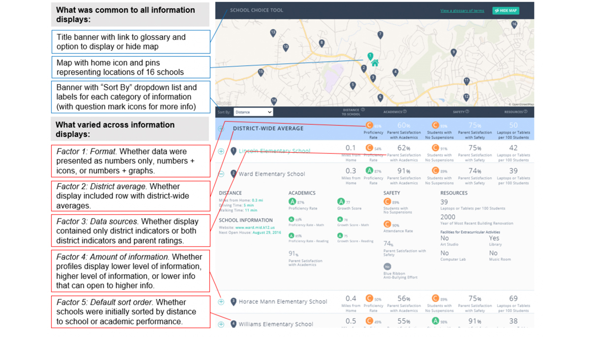
Note: This figure illustrates one of the 72 information displays prepared for the experiment. The right side shows a school display with the following levels of each factor: school data formatted as graphs, inclusion of a district average as a reference point, inclusion of parent ratings, progressive disclosure for the amount of information, and default sort by distance from home to the school. The boxes on the left side indicate how each factor modifies the display.
After parents had time to review the school profiles, we asked them to rank their preferred schools as if they were actually choosing schools for their children. We found that some simple design changes, such as changing the default order in which schools were presented, induced meaningful changes in the types of schools selected. Specifically, initially sorting schools by academic performance (instead of sorting by distance-from-home) nudged parents to choose schools with higher academic performance. The academic performance of the average selected school was 5 percentile points higher (and parents selected schools that were half a mile farther away), equivalent to an effect of 0.20 standard deviations. Other design features had a smaller impact than the sort-order effect (Table 1), but on a cumulative basis, these changes were large. For example, parents chose schools with an academic performance that was 19 percentile points higher (compared to the worst-performing display) when we sorted schools by academic quality in a display that also limited the total amount of information, highlighted academic performance with letter-grade icons, included parent survey data on academic quality, and included the district’s average performance as a reference point.
Table 1. Impacts on characteristics of selected schools (nudge effects)
|
|
Effect size for |
||||
|
Factor |
Factor level |
Academics |
Distance |
Resources |
Safety |
|
Format |
Numbers only |
-0.05 |
0.01 |
0.02 |
-0.02 |
|
Numbers + icons |
0.05* |
-0.03 |
-0.04 |
0.12* |
|
|
Numbers + graphs |
0.00 |
0.02 |
0.02 |
-0.11 |
|
|
District average shown |
No |
-0.02 |
0.02 |
0.01 |
-0.03 |
|
Yes |
0.02 |
-0.02 |
-0.01 |
0.03* |
|
|
Source of information |
District only |
-0.01 |
-0.01 |
0.06* |
-0.06 |
|
District + parent ratings |
0.01 |
0.01 |
-0.06 |
0.06* |
|
|
Amount of information |
Lower amount |
0.04* |
0.00 |
-0.09 |
0.00 |
|
Progressive disclosure |
0.05* |
-0.03 |
-0.09 |
0.01 |
|
|
Higher amount |
-0.09 |
0.02 |
0.18* |
-0.01 |
|
|
Default sort order |
By distance |
-0.10 |
0.19* |
-0.01 |
-0.01 |
|
By academics |
0.10* |
-0.19 |
0.01 |
0.01 |
|
Notes: Each column of the table summarizes the results of a separate regression. The effect sizes represent, in standard deviation units, the effect of each display strategy on the average z-score of selected schools within a given category of information. The asterisk (*) and bold blue text indicate when a strategy is likely to have impacted selections: effect sizes are highlighted when the probability of the strategy having a true effect greater than zero was greater than 0.70 (calculated from a Bayesian posterior distribution).
An important takeaway from this work is that design decisions can affect parents’ choices by nudging them to certain schools or types of schools. However, there are some tradeoffs and caveats to consider. First, we also examined the effects of these design decisions on parents’ understanding of the information and their self-reported satisfaction with each display, finding that displays that performed better on one outcome often performed worse on another. For instance, representing data using only numbers (without graphs or icons) maximized understanding, but adding graphs maximized user satisfaction (at the expense of understanding). In other cases, the display that nudged parents to select higher-performing schools was less understandable or satisfying than alternative designs. This was also the case with sorting by academic performance, which made the display slightly less understandable to users.
Second, an important limitation of the study is that this was only a hypothetical choice exercise. The stakes are higher when parents confront an actual school choice decision, which could lead parents to seek additional data (particularly the opinions of their peers) or consume the information on a school website more carefully. We look forward to future research testing for these effects in a context that involves actual school choice decisions.
Even with these caveats, this study has implications for policy, particularly at the level of school districts designing school information displays. The past few decades have produced education reforms in the United States that ask parents to make choices for their children. These reforms have made parents’ decision making extremely consequential, both for their own children (in determining which schools they attend) and the broader functioning of U.S. schools (in determining what types of schools flourish, and what types fail, in school choice markets). Knowingly or not, policymakers affect these choices. Even seemingly mundane decisions about the order in which schools appear and whether data are presented graphically nudge parents toward one type of school or another. These nudges are unavoidable, and the costs of choosing one design option over another are often negligible. Based on the results of our experiment, we believe that tweaking the design of school information displays—if done responsibly—offers a low-cost opportunity to make school choice policies work more effectively.