
The world of education is becoming inundated with data, and the growing use of technology in schools has made it even easier to collect and report data continuously. With trillions of data points at our fingertips, we are faced with the question: how do we make sense of all this information?
This post is the first in a series called VisualizED, which is about data visualization—the graphic representation of information to show trends, patterns, or meanings—in education. Many of us have seen and maybe even been influenced by Hans Rosling’s dazzling use of visualizations to tell data stories. What Rosling and other designers have shown us is that, with the right approach, data visualization can be a valuable way to summarize data in an easy-to-interpret, actionable format that enables the viewer to make comparisons and detect patterns. It is already being used for school report cards, school choice selection websites, teacher performance reports, student performance reports, and more.
Data visualization is valuable because it capitalizes on our innate ability to understand and interpret visual stimuli before our conscious brain joins the party. Visual information offers a quick stick, enabling fast, accurate interpretation and stronger transitions from short- to long-term memory.
Because the purpose of collecting data in education is insight, and because the parents, teachers, and school staff consuming these data face competing demands for their time and cognitive bandwidth, effective data visualization serves a necessary purpose. But not all visualizations are effective. This blog series will discuss the good, the bad, and the ugly of education data visualizations, beginning with posts on school and teacher performance data.
We welcome suggestions from our readers on other areas of education data visualization that they’re interested in. If you’d like to make a suggestion, please leave a comment (requires registration), tweet @edimpactlab, or shoot us an email.
How does my school compare with others?
One important use of school report cards is to make it easy for parents to compare their children’s school with other schools or established benchmarks. A common way to do this is by using bar charts.
Bar charts are a useful option when comparing multiple groups. With a bar chart, viewers typically compare the relative lengths of immediately adjacent bars and clusters of bars and look for overall trends. This type of chart is a favorite for most people because it’s easy to create and reliable to interpret. But, as we show here, sometimes the standard version needs a refresh.
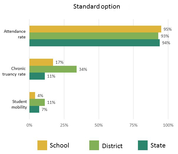
In the standard option (top), which is based on a real state report card from Illinois, viewers might compare the school rate with the district and state rates within each cluster. This tells them how the school is performing relative to average performance for the district and state. But because all of these measures are in a single chart, viewers might also be tempted to compare the clusters with each other. This is problematic because these clusters aren’t comparable. Ideally, chronic truancy and student mobility would be low and attendance rate would be high. This means that viewers need to spend more time thinking about where the school should fall relative to the benchmarks. For attendance, the bar for the school would ideally be longer than the others, whereas for truancy and mobility, it would be shorter. We can make it easier for viewers by incorporating two key changes:
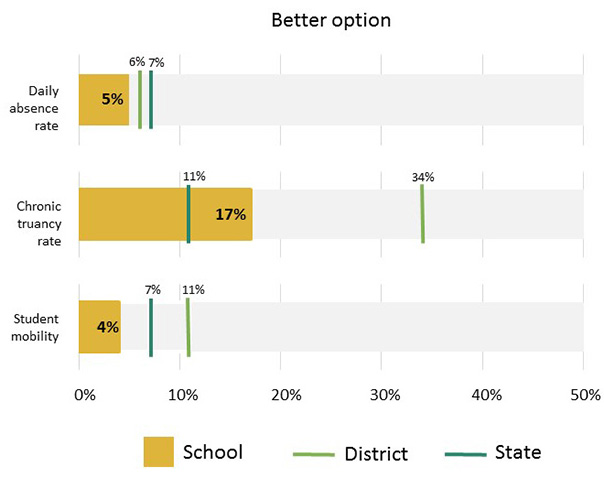
1. Use a bullet chart. In the better option (bottom) we are using a bullet chart. This chart simplifies the process of making comparisons by including a bar only for the feature measure, in this case school rates for each of three metrics. It then uses markers for the comparative measures, in this case the district and state rates. This enables viewers to easily see how far above or below the school is from the benchmarks represented by district and state averages.
2. Use comparable metrics. In this case, attendance rate represents the average daily attendance. A more comparable metric with the other two options would be average daily absences, the inverse of attendance, which is what is shown for the first bar in the better option. Switching to a daily absence rate has multiple benefits. The first is that a shorter bar is now always better across the chart. It also enables rescaling the horizontal axis so that instead of having a range of values that spans 0 to 100 percent, the chart can have a smaller range—in this case, 0 to 50 percent—reflecting the new set of relevant values. Using this smaller range makes it easier to see the differences for these low percentage values. The final benefit is that it enables viewers to make a general conclusion about trends by comparing across the metrics. Here, viewers can conclude that the school is consistently performing better than the district average and tends to perform close to or better than the state average.
These changes give you a chart that is viewer friendly and does what a school report card should do: enable a parent (or other viewers) to see at a glance if this school is better or worse than other schools.